Design Patterns — Kitchen Sink
Kitchen Sink is a fictitious cooking site prototype created by me.
Research
To better understand the most popular and successful design patterns, I examined the top ten recipe sites based on global traffic rank, including Allrecipes.com, foodnetwork.com, food.com, and more. What most had in common were advertisements, so many in number that it seemed they were a natural part of the UI. The majority also featured the continuous scrolling pattern, which can have the effect of sending the user into an endless abyss of content that may or may not have any value.
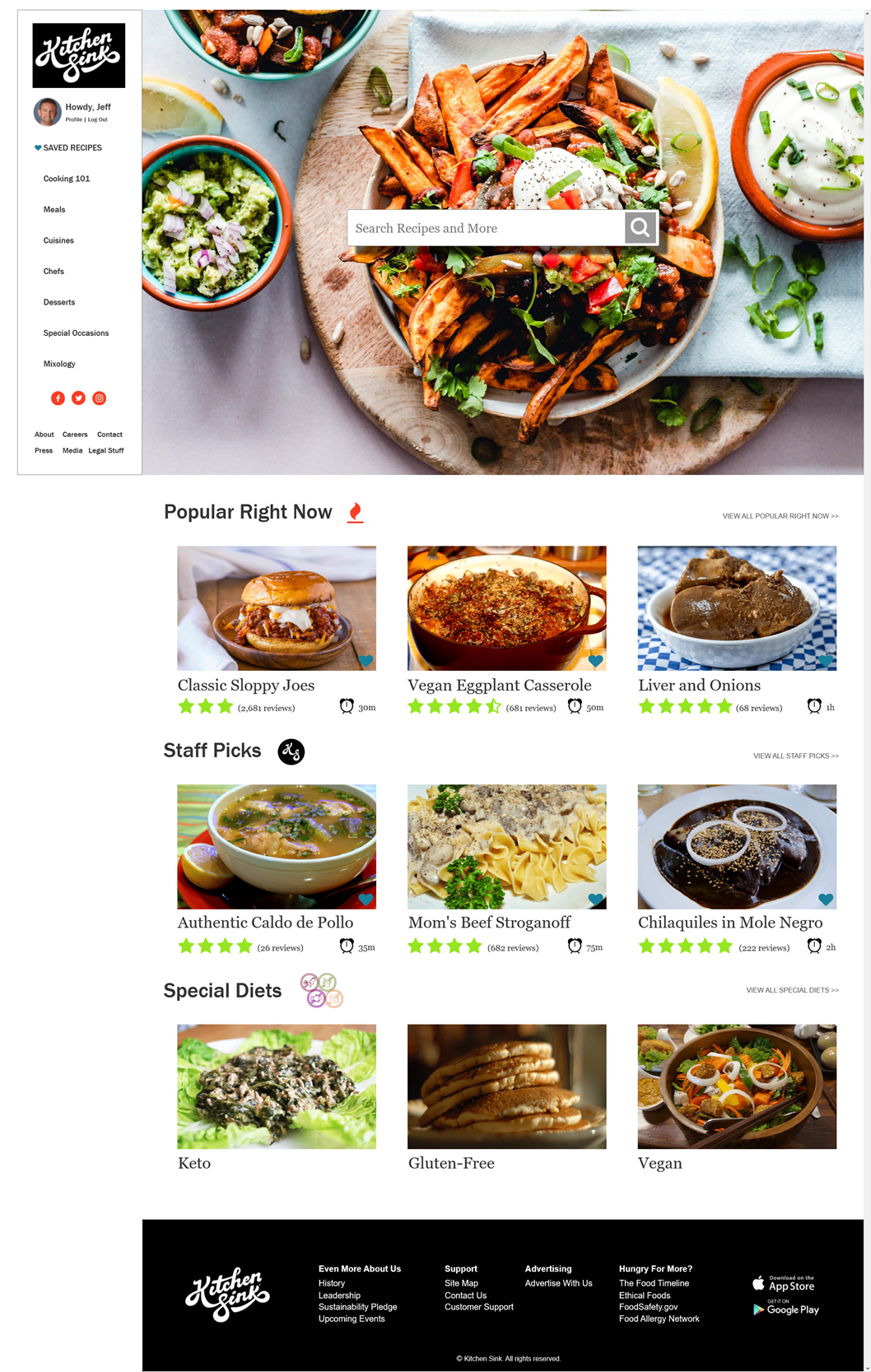
My goal with Kitchen Sink was to offer a clean, elegant, and uncluttered UI with a strong focus on the visuals. The presentation and consumption of food make for a very sensual experience, and successful cooking and food preparation websites are impactful when they feature large, high-res photos of the ingredients and end products. I purposefully chose the clearest, most appetizing photos to make the emphasis about the food. The nuts and bolts of the respective recipes are kept at bay at the recipe detail level so as not to distract from the frontend “window-shopping” feel.
Full homepage mockup
Full recipe page
Kitchen Sink Design Patterns
Fat Footer. This fat footer was used to acquaint the user with related resources which are not critical to recipe lookup. The tucked away footer is perfect for housing some of the more granular details of the business itself (the fact that Kitchen Sink has a sustainability pledge is great, but not helpful when you’re ravenous). I treated it like the epilogue of a great book – useful and interesting but not indispensable, with the bonus of keeping a user engaging with the site.
Home Link. This is commonly used to help the user get back to the starting location of the site. At every page the user can click the Kitchen Sink logo in the top left or in the footer to navigate back to the Home Page.
Breadcrumbs. I considered the use of breadcrumbs but couldn’t decide on a style that I liked, and I also didn’t have enough of the site mapped out to really feel confident in the flow. If I had used them I would have given my user a “back to search results” crumb on the recipe page and a “back to profile page” from the submit recipe page.
Favorites. I give the users the ability to save the recipes they come across by clicking the blue heart in the bottom righthand corner of each recipe image. This affords them freedom to consume content at a time of their choosing and I used the Gutenberg Principle as rationale for the heart placement.
Rate Content. Recipe sites are enhanced by community involvement and a sufficient reviews structure. Trust in the quality of the content and accuracy of the recipes stem from the free and easy sharing of individual experiences related to that recipe or piece of content. Star ratings are in place for every recipe as well as the ability to leave a review from the recipe page.
Progressive Disclosure. I used progressive disclosure on the Recipe Page. The Chocolate Molten Lava Cakes recipe was reviewed thousands of times: to display all of these on screen one after the other could be overwhelming to the user. This pattern protects against this feeling of being overwhelmed, but gives the user the ability to continue viewing additional reviews with the “More Reviews” link (as shown in the mockup above).
Maximum Character Text Field. In this pattern we have to let users know that they are up against a set number of characters they can work with for a given text field. My Submit Recipe page lets the user fill in a maximum of 200 characters for the recipe description. The recipe description is meant to be a short summary of why this recipe is the greatest thing since sliced bread and to do so in short order. This character limit pattern, which updates as the user types in the characters, is preferable to the common pattern which shows something like 71/200, which can be harder for the user to comprehend quickly.


